Katie Blechinger //
Copywriter (Execution)
Copywriter (Execution)
Curtis Kiser //
Art Director (Execution)
Art Director (Execution)
Dan Draper //
Art Director (Concept)
Art Director (Concept)
Gil Templeton //
Creative Director + Copywriter (Concept)
Creative Director + Copywriter (Concept)
BrandBossHQ // Agency

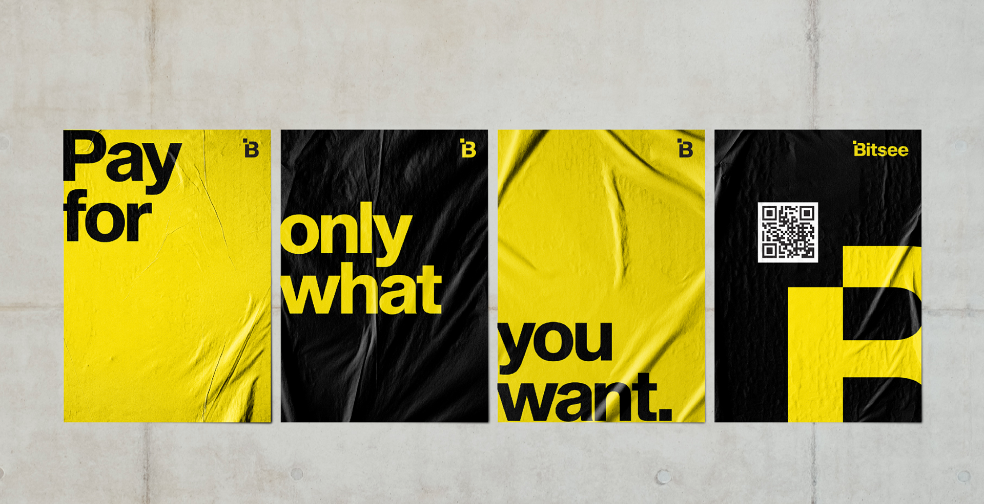
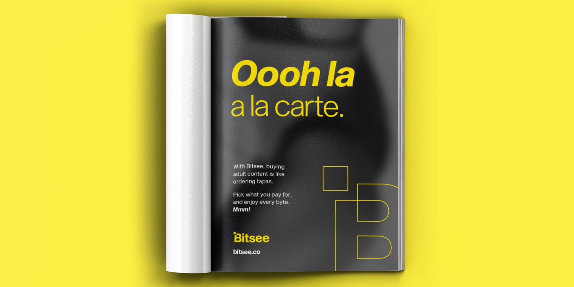
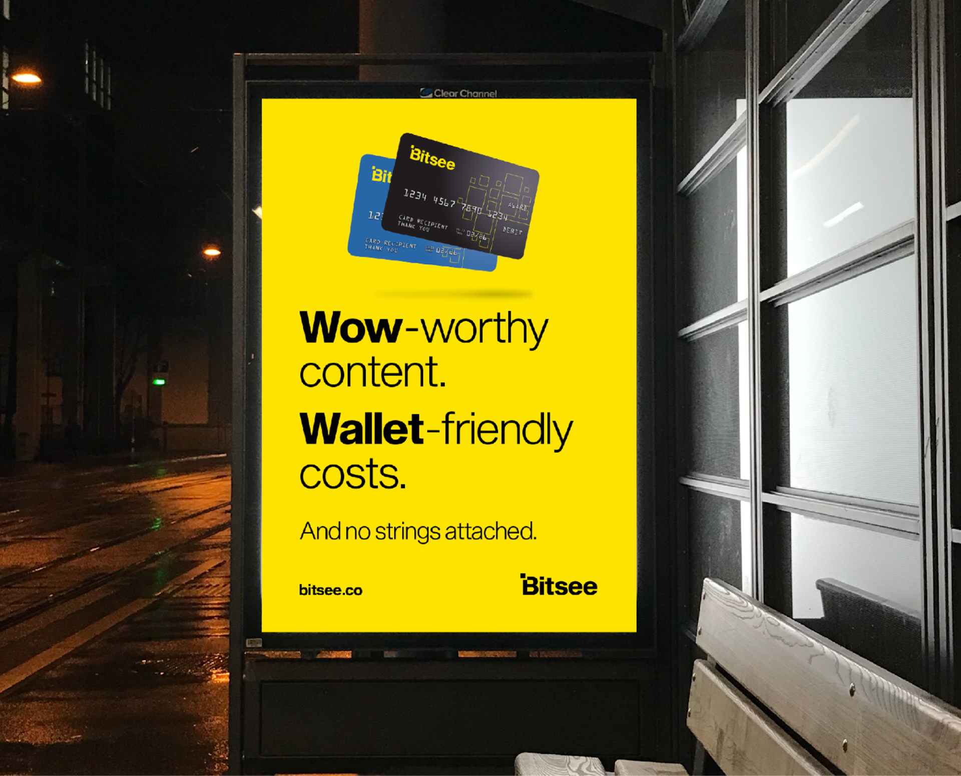
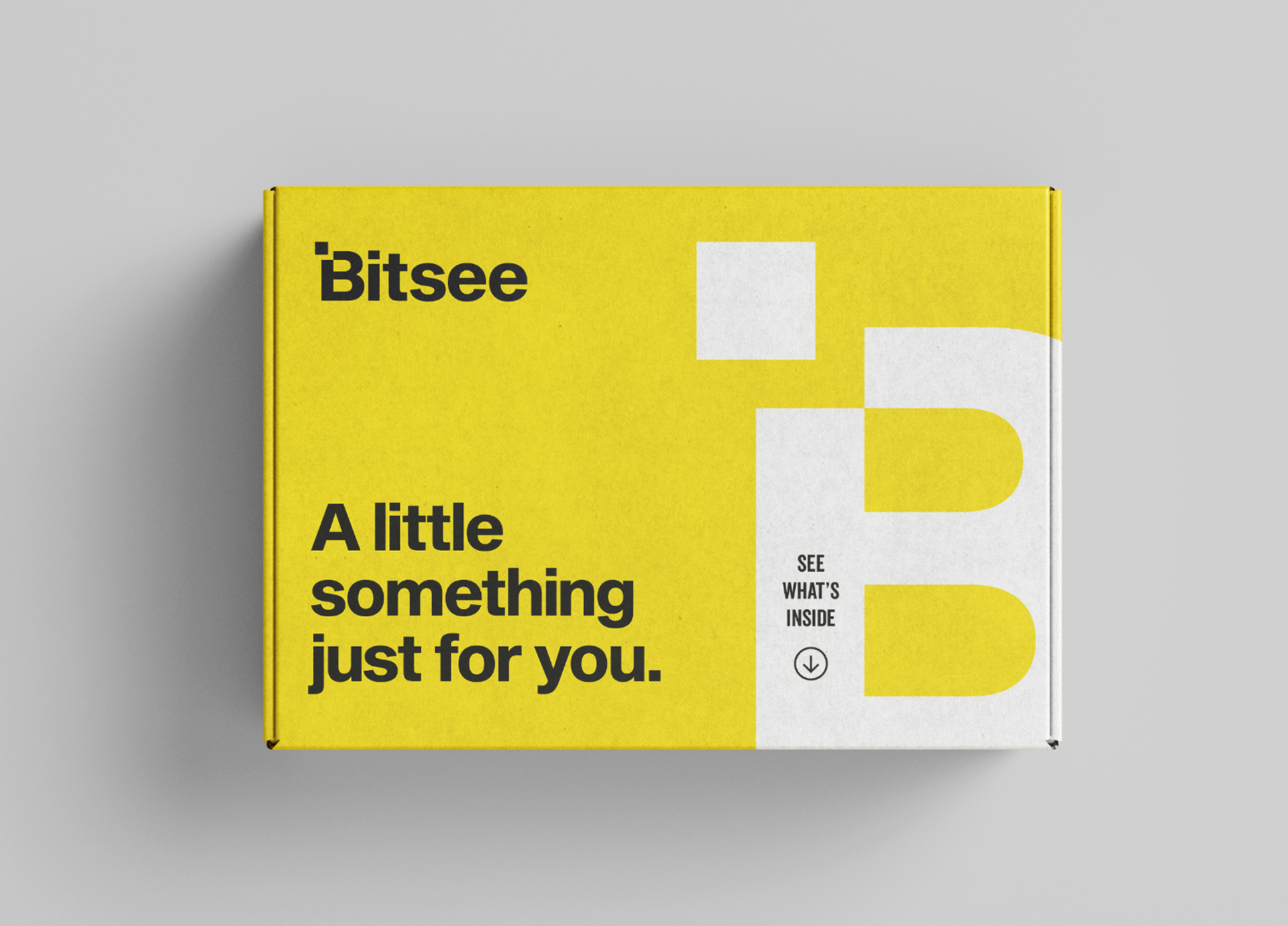
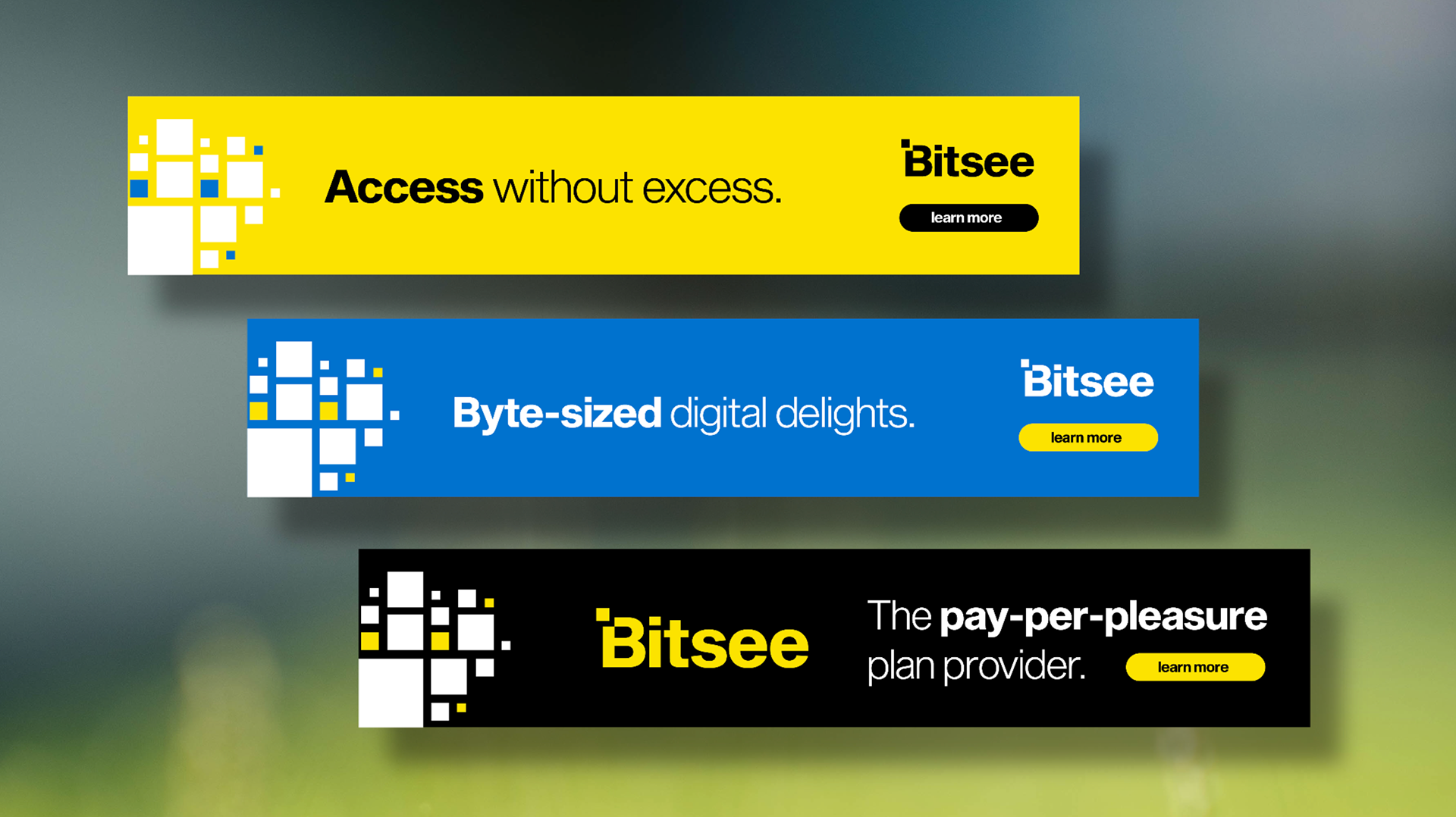
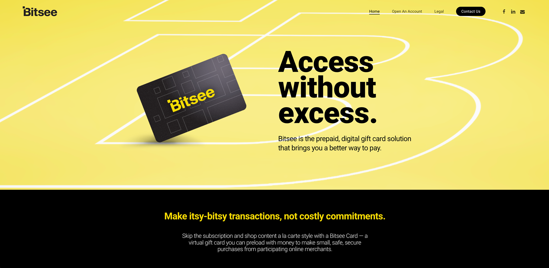
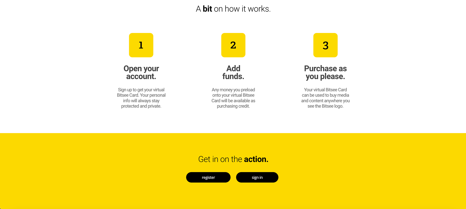
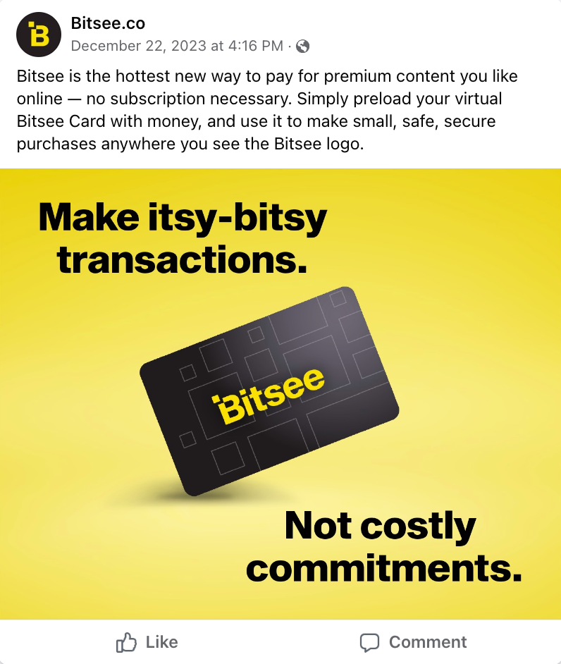
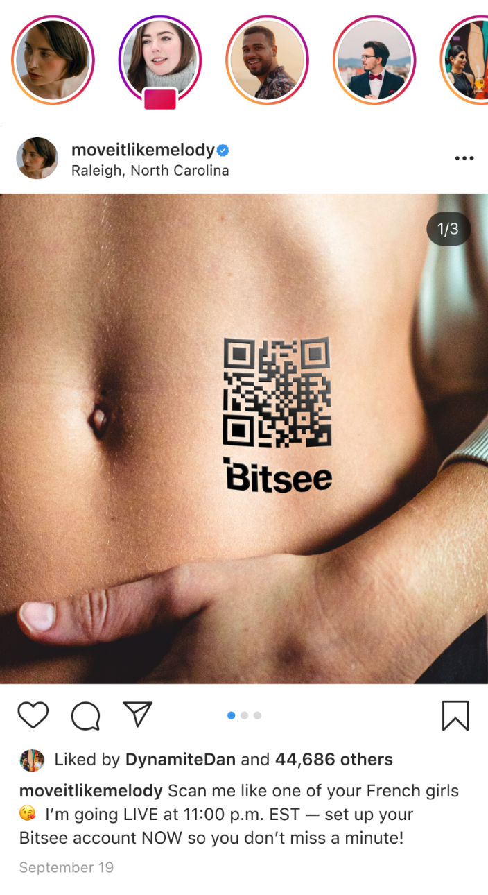
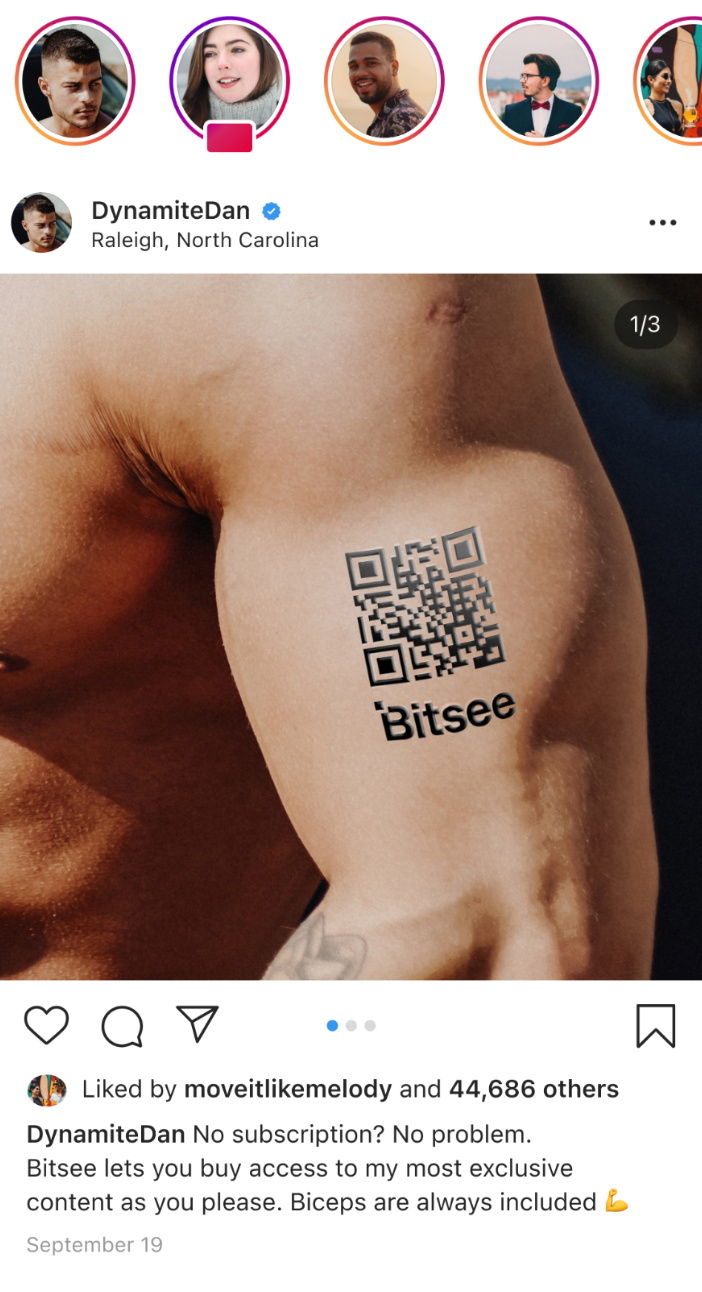
Why buy the whole thing when you only want to see a bit? Bitsee lets users make smaller, one-off purchases from adult entertainment websites instead of paying the full subscription cost.
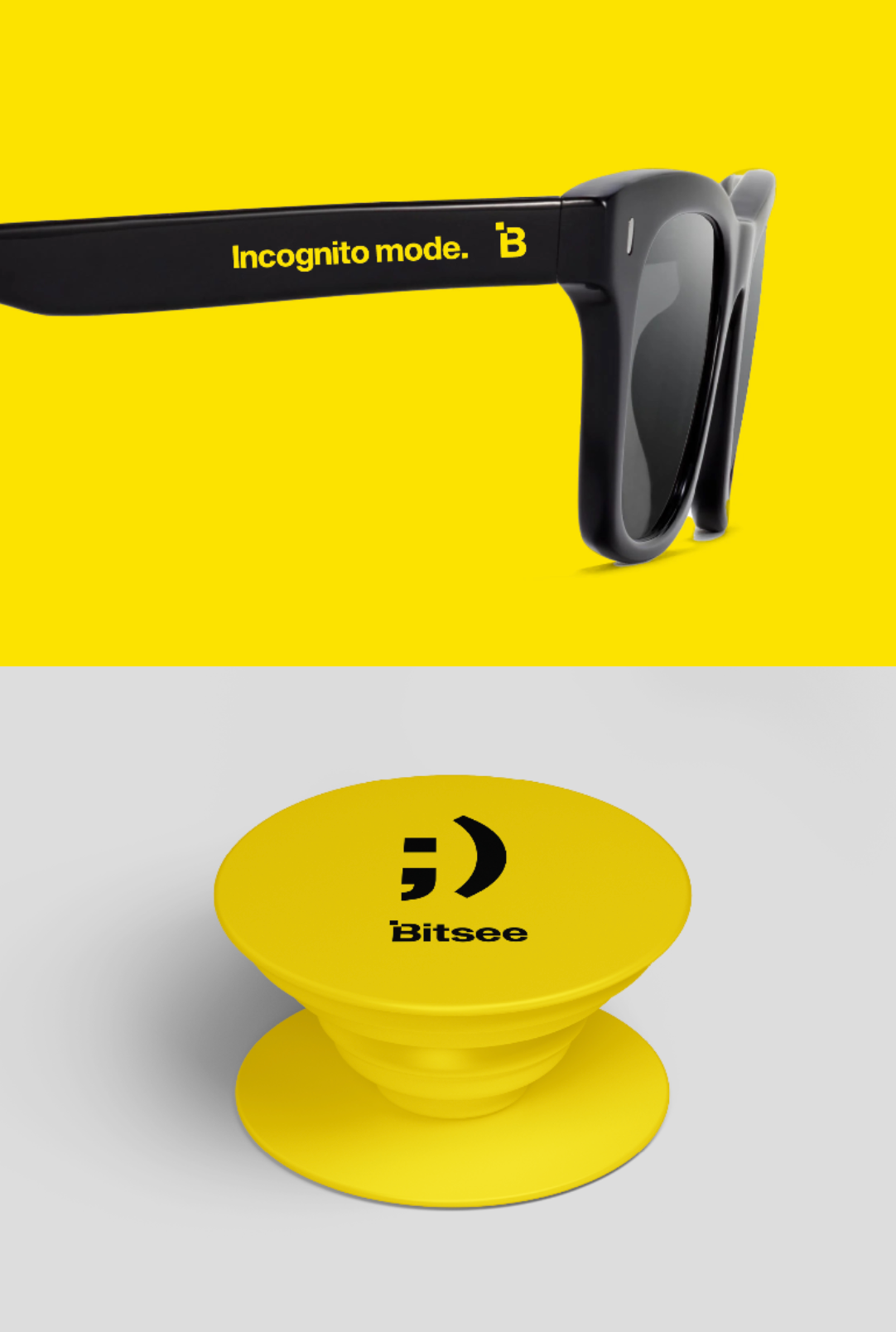
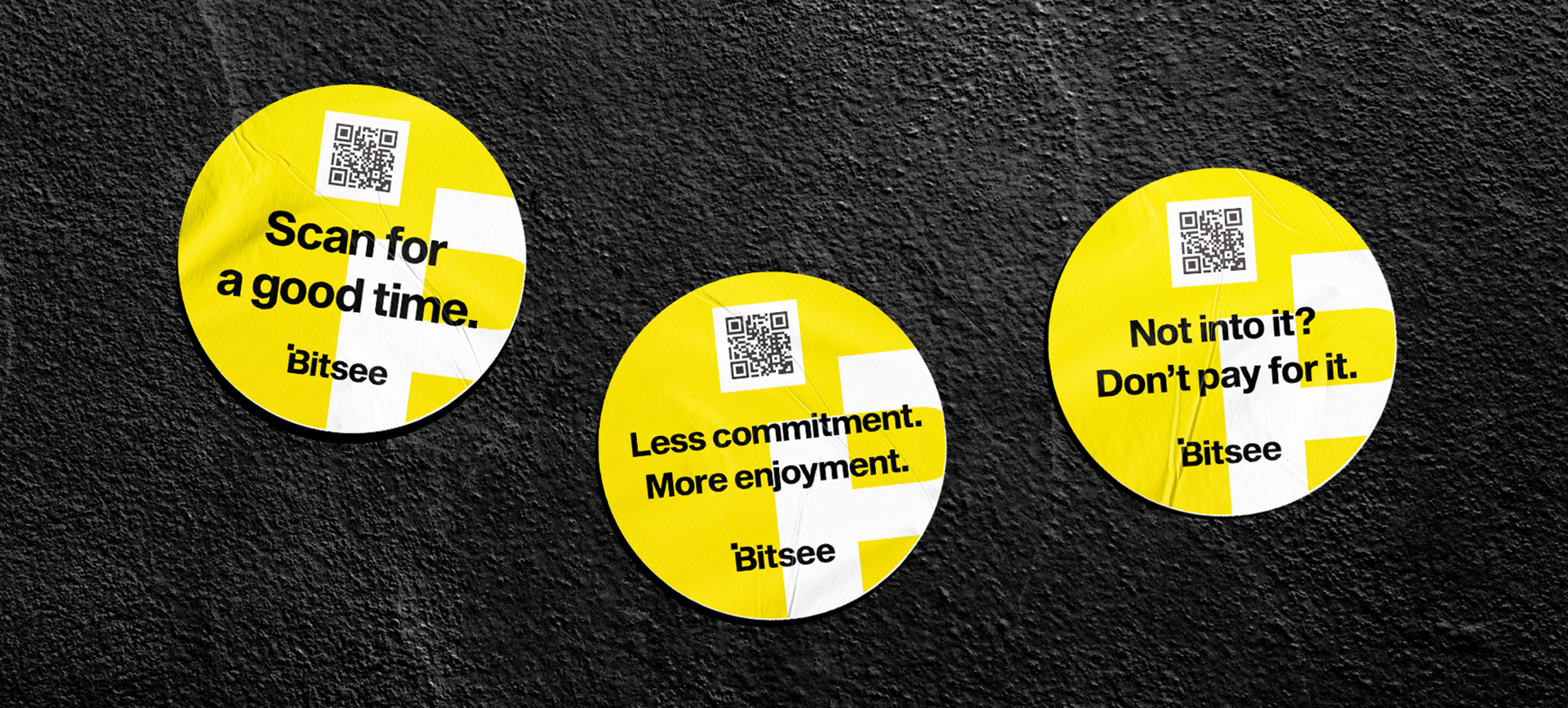
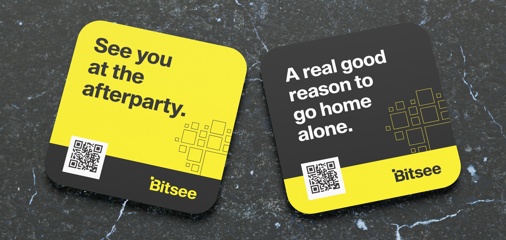
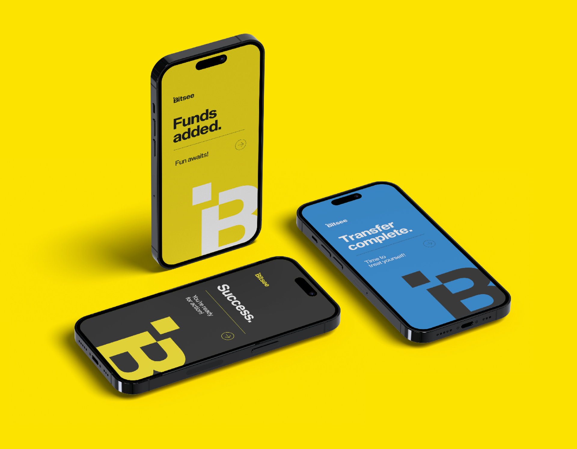
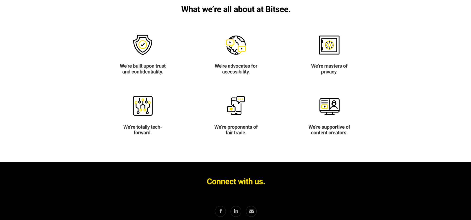
In a category where credibility is everything, we created an identity that built both trust and recognition. The messaging kept it light and playful, mirroring the ease of the product while nodding to the nature of the content. The look was bold, memorable, and impossible to miss... even in the most ✨ distracting ✨ online environments.